SECI New Logo: India's Solar Agency Rebrands Beyond Solar Power
SECI has unveiled a new logo and the tagline 'Energy Forever, For All', designed by NID Ahmedabad to reflect its move beyond solar into storage and hydrogen.

Key points
- The Solar Energy Corporation of India (SECI) unveiled a new logo and the tagline 'Energy Forever, For All' on November 17, 2026.
- The identity was designed by the National Institute of Design (NID), Ahmedabad, in consultation with SECI.
- The logo uses blue for institutional trust and expertise, green for sustainability and a 'sunrise saffron' tied to India's visual identity.
- SECI said its old logo mainly reflected its solar origins and no longer matched its wider work in wind, hybrid projects, energy storage and green hydrogen.
- The new logo will be rolled out gradually across SECI's communications, digital platforms and stakeholder materials.
The Solar Energy Corporation of India (SECI), the state-owned company that runs many of India’s large renewable energy auctions, unveiled a new logo and the tagline “Energy Forever, For All” on Tuesday, November 17, 2026. The identity was designed by the National Institute of Design (NID) in Ahmedabad. SECI says the change reflects how far its work has moved beyond solar power, into wind, energy storage and green hydrogen.
What happened?
SECI announced the new brand identity on November 17, according to SolarQuarter, Indian Masterminds and Adgully, which all reported the launch that day. The rebrand pairs a new symbol with a new tagline and follows a revision of the company’s vision and mission statements.
None of the reports named an official who unveiled the logo or described a launch event. SolarQuarter and Adgully said the new logo will be adopted step by step across SECI’s communications, digital platforms and dealings with stakeholders, rather than switched over on a single day.
What does the new SECI logo look like?
The logo is built around three colours, each with a stated meaning:
| Colour | What SECI says it represents |
|---|---|
| Blue | Institutional trust, technical expertise and leadership in renewable energy |
| Green | Regeneration, sustainability and India’s commitment to a cleaner environment |
| Sunrise saffron | India’s (“Bharat’s”) visual identity and the start of its renewable energy shift |
According to Adgully, the mark is made of rotating shapes inspired by wind turbine blades. At its centre sits a Vajra, a traditional symbol of power, which the design uses to suggest activation. Around it, a “vortex” of leaf shapes is meant to suggest a self-sustaining cycle, and six design elements stand for the sky, the earth and the four directions. Adgully summed up the idea as a logo that “represents energy in continuous motion”.
The design was created by NID Ahmedabad, one of India’s leading design schools, working with SECI’s team.
Why did SECI rebrand?
SECI was founded in 2011 and, as its name suggests, began with a focus on solar power. The company said its previous logo mainly represented those solar origins and no longer reflected the scale and range of what it does, SolarQuarter and Indian Masterminds reported.
Its mandate now covers:
- solar and wind projects
- hybrid renewable projects that combine sources
- round-the-clock renewable electricity supply
- energy storage
- green hydrogen and its derivatives
Indian Masterminds describes SECI as a central public sector enterprise under India’s Ministry of New and Renewable Energy, working in project implementation, bidding and power trading.
What does ‘Energy Forever, For All’ mean?
The tagline replaces any reference to the sun with two broader promises. “Energy Forever” points to renewable sources that do not run out, and to SECI’s push into storage and round-the-clock supply, which aim to keep clean power flowing when the sun is down or the wind drops. “For All” speaks to SECI’s role as a public company supplying power across the country. Read together with the new colours and shapes, the message is that SECI now sees itself as a broad clean-energy company rather than a solar specialist.
Why it matters for design
The SECI rebrand follows a familiar pattern: a company named after one product or technology grows into a wider business and uses a new identity to signal the shift without changing its name. The new mark keeps a link to energy and nature through turbine and leaf shapes, while adding a cultural reference in the Vajra and saffron colour that ties the brand to India.
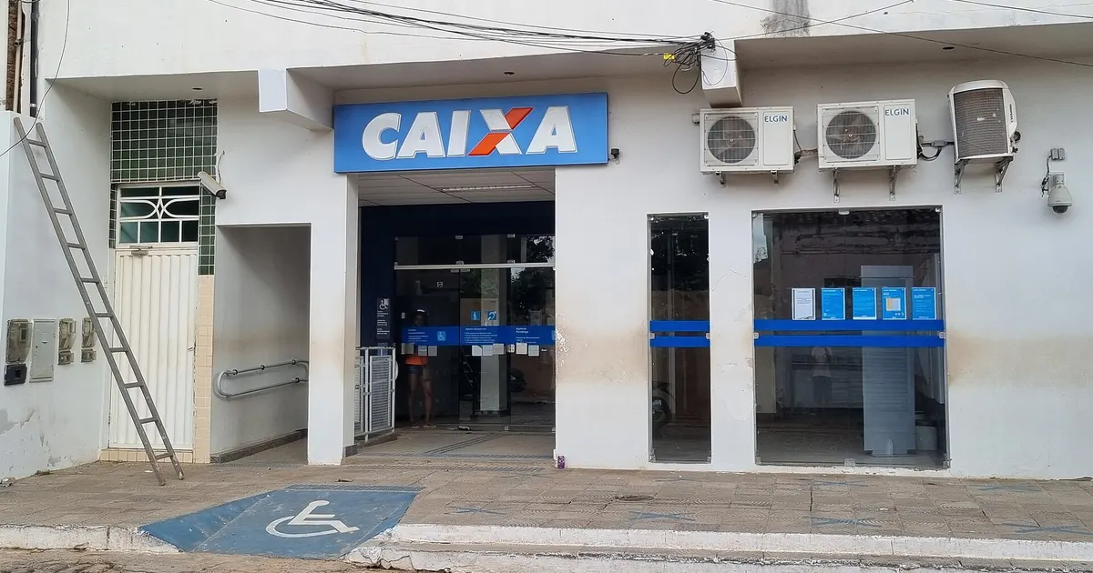
It is also a high-profile commission for NID, a public design school. This year has seen several heritage brands rethink their identities, from Caixa’s first rebrand in 30 years to Takara Tomy’s new logo.
What happens next?
Expect to see the new logo appear gradually on SECI’s website, tender documents and project signage as the rollout continues. The reports did not give a completion date for the switchover or the cost of the rebrand.
Frequently asked questions
What is SECI's new tagline?+
SECI's new tagline is 'Energy Forever, For All'. It was launched with the new logo on November 17, 2026, to reflect the company's wider role in renewable energy beyond solar power.
Who designed the new SECI logo?+
The National Institute of Design (NID) in Ahmedabad designed the new logo in consultation with SECI, according to reports by SolarQuarter, Indian Masterminds and Adgully.
Why did SECI change its logo?+
SECI was set up in 2011 with a focus on solar energy. It said the old logo mainly represented those solar roots, while the company now works on wind, hybrid and round-the-clock renewable power, energy storage and green hydrogen.
Sources
- Solar Energy Corporation of India
- National Institute of Design
- Solar power in India
- Rebrand
- Logo design

PFM Today Newsroom · News Desk
The PFM Today Newsroom tracks developments across startups, AI, design, business and more. Stories are researched from primary sources and reputable outlets, written with AI assistance, and reviewed against our editorial policy before publishing. Read our editorial policy.