Caixa New Logo: Brazil's State Bank Rebrands After Nearly 30 Years
Caixa Econômica Federal has unveiled a new logo and identity by Tátil Design, with a redrawn X, brighter colours and a rollout to branches through 2030.
Key points
- Brazilian state-owned bank Caixa Econômica Federal unveiled a new visual identity on November 9, 2026, its first major identity change in almost 30 years.
- The new identity was created by Brazilian agency Tátil Design and keeps the bank's name, its blue and orange colours and its X symbol.
- The wordmark now mixes upper- and lowercase letters at the same height, and the X has been redrawn with more depth.
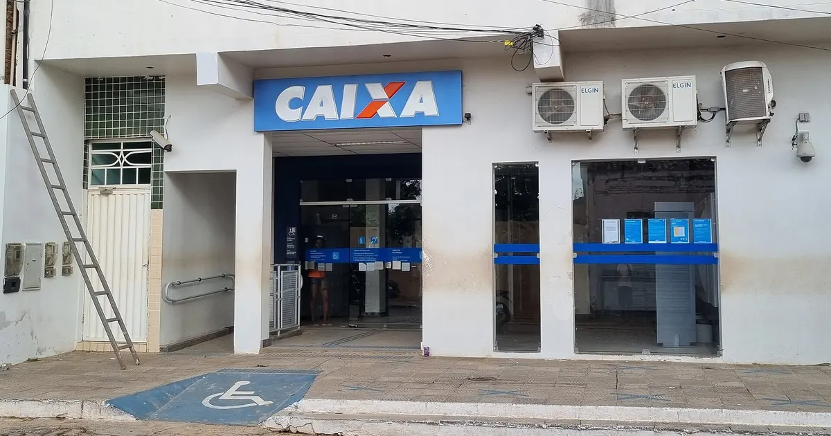
- Eleven branches across Brazil's five regions already carry the new look, and the rest will be updated through 2030.
- The rebrand comes with a new tagline, "Vem realizar", and a planned app that will bring Caixa's services into one place.
Caixa Econômica Federal, Brazil’s state-owned savings bank, unveiled a new logo and visual identity on Monday, November 9, 2026, its first major brand overhaul in almost 30 years. Designed by Brazilian agency Tátil Design, the refresh keeps the bank’s familiar X and its blue and orange colours but makes them brighter and friendlier, with an eye on digital channels and younger customers. The new look is already on 11 branches and will reach the rest of the network by 2030.
What happened?
Caixa presented the new identity on November 9, alongside a new tagline, “Vem realizar” (roughly, “Come and make it happen”), according to Brazilian marketing trade publication Meio & Mensagem and business outlet Times Brasil. Creative Bloq covered the redesign on November 11.
The bank was founded in 1861 and turns 165 this year. Times Brasil reported that Caixa has gone through ten brand configurations in its history. The X became the centre of the brand in 1997 and remained the reference point through later updates in 2005 and 2017. The bank describes the new system as its first new visual identity in almost three decades.
The identity was created by Tátil Design, a Brazilian branding agency led by CEO Fred Gelli. The launch film was produced by Alia, Meio & Mensagem reported.
What does the new Caixa logo look like?
The changes are evolutionary rather than a clean break. The name, the X and the two-colour palette all stay. What has changed is how they are drawn:
- The wordmark now mixes uppercase and lowercase letters set at the same height, with a rounder “a” that softens the stiffer, slightly slanted all-caps lettering of the old logo.
- The X has been redrawn with more depth. According to Times Brasil, the way its strokes meet is meant to represent the bank’s two sides: its social role and its commercial business.
- The colours are more vibrant versions of Caixa’s blue and orange. The bank says blue stands for solidity and security, while orange represents diversity and Brazilian identity.
- Graphic patterns are built from the X. Creative Bloq noted that, repeated, the shape suggests a box (the Portuguese word “caixa” means box, as in a savings box) and also a house roof, a nod to Caixa’s role as Brazil’s biggest mortgage lender.
The wider system goes beyond the logo. Meio & Mensagem reported that it includes a more direct tone of voice, illustrations by artists from different regions of Brazil and photography inspired by the country’s diversity. It also brings more than 50 projects and sub-brands under one system, with the main Caixa brand at the centre.
Tátil framed the work as a deliberate contrast with the fintech crowd. “While every app was busy calling itself a bank, we went against the grain,” the agency said, as quoted by Creative Bloq.
Why it matters
Caixa is one of the most visible institutions in Brazil. It reports 24,600 service points, including 20,700 lottery outlets and “Caixa Aqui” banking correspondents, and a presence in more than 97% of the country’s municipalities, according to BNLData. Its network even includes 11 truck branches, two boat branches and four container units. Changing the brand on that scale is a long, expensive job, which explains the multi-year rollout.
The rebrand is also tied to a broader push to modernise. Caixa president Carlos Vieira linked the new identity to changes in services, products and internal processes, including the use of artificial intelligence. Speaking at the launch, he said the new brand reflects “the bank we are building for the future,” as reported by Meio & Mensagem.
Marketing director Gerson Bordignon said the brand still stands for an institution connected to the individual and collective achievements of Brazilians, BNLData reported.
The project has also drawn scrutiny over cost. Cartões e Viagens, citing InfoMoney and Valor Econômico, reported that Caixa paid about R$3.5 million between 2024 and 2026 on the brand change project. That figure does not cover the full cost of updating branches across the country.
Like other recent rebrands covered by PFM Today, such as Takara Tomy’s first new logo since its 2006 merger and Benelli’s redesigned lion identity, Caixa’s approach keeps the heritage symbol and modernises the details around it rather than starting from scratch.
Key details
- Announced: Monday, November 9, 2026
- Designer: Tátil Design (CEO Fred Gelli); launch film by Alia
- Kept: the Caixa name, the X symbol, blue and orange
- Changed: mixed-case wordmark, redrawn X, brighter tones, new illustration and photography style
- Tagline: “Vem realizar”
- Reported project cost: about R$3.5 million (2024–2026)
- Branches with the new look at launch: 11, across all five of Brazil’s regions
What happens next?
The rollout to physical branches will be gradual. Times Brasil reported that the remaining branches will get the new identity as they go through renovation and maintenance, with the process expected to run until 2030. One of the first showcases is a concept branch in the Conjunto Nacional building on Avenida Paulista in São Paulo, which was set to reopen to customers on Wednesday, November 11.
Caixa also announced a new app, without a launch date, that will combine services currently spread across several separate apps. According to BNLData, planned features include fully digital account opening, Conta On! accounts for young people aged 8 to 17, a citizen platform for social benefits, the UAU loyalty programme, new credit and investment options, Open Finance integration and AI-supported self-service with help from staff.
For most Brazilians, the first place they will notice the change is on their phones, before the new X appears above their local branch.
Frequently asked questions
Why did Caixa change its logo?+
Caixa says the new identity is part of a wider modernisation of the bank, including its services, products and internal processes. Reports say the bank wants a more contemporary look that works better on digital channels and appeals to younger Brazilians.
Who designed the new Caixa logo?+
The new identity was designed by Brazilian branding agency Tátil Design, led by CEO Fred Gelli. The film that introduced the new brand was produced by Alia, according to Meio & Mensagem.
When will Caixa branches show the new logo?+
Eleven branches across Brazil's five regions already used the new identity at launch, including a concept branch in the Conjunto Nacional building on Avenida Paulista in São Paulo. The remaining branches will switch gradually during renovations and maintenance, with the work expected to finish by 2030.
Sources
- Creative Bloq – This bank's vibrant new logo design ticks all the boxes
- Meio & Mensagem – Caixa apresenta nova identidade visual após quase 30 anos (Portuguese)
- Times Brasil – Caixa renova identidade visual após quase 30 anos (Portuguese)
- BNLData – Caixa lança nova marca e amplia processo de modernização do banco (Portuguese)
- Cartões e Viagens – Caixa apresenta nova logo após projeto de R$ 3,5 milhões (Portuguese)
- Caixa Econômica Federal
- Logo redesign
- Brand identity
- Tátil Design
- Brazil
- Banking

PFM Today Newsroom · News Desk
The PFM Today Newsroom tracks developments across startups, AI, design, business and more. Stories are researched from primary sources and reputable outlets, written with AI assistance, and reviewed against our editorial policy before publishing. Read our editorial policy.