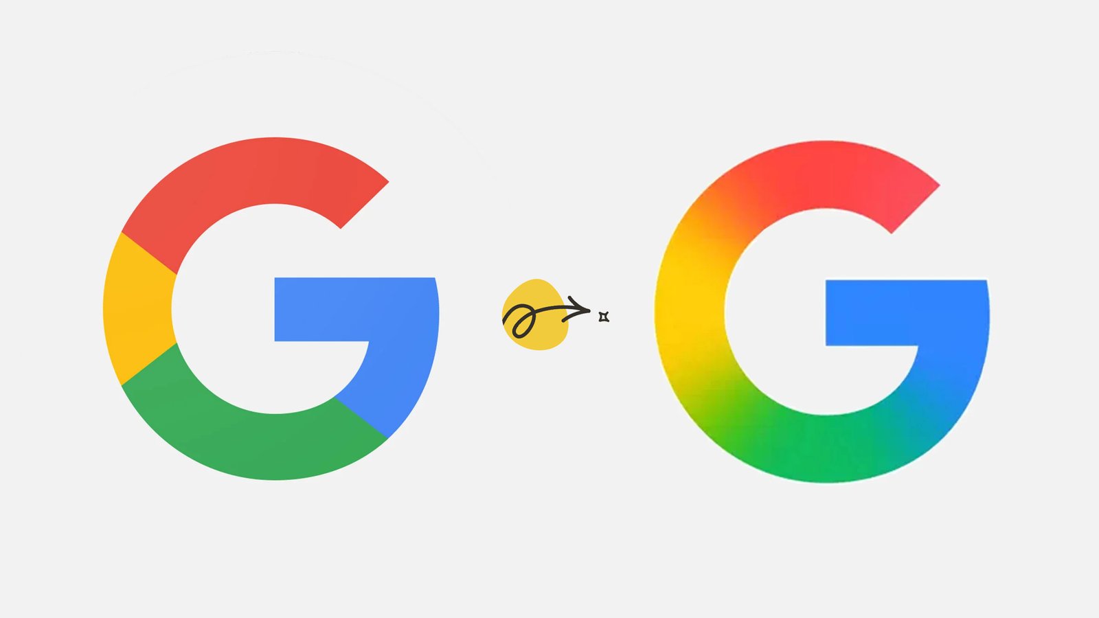
In a rare design move, Google G logo makeover has been officially revealed, marking the tech giant’s first update to its iconic ‘G’ symbol in over a decade. While the changes might appear subtle at first glance, they reflect Google’s evolving brand identity in an era of AI, minimalism, and cross-platform consistency.
A Decade Later: Why Google Decided to Refresh the Google G logo
Google’s last major logo overhaul was in 2015 when it transitioned to a flat, sans-serif design.
Now, as the company advances deeper into AI, hardware, and immersive experiences, the Google logo update 2025 serves multiple purposes:
- To create a more adaptable and scalable logo for diverse devices and screen sizes.
- To reinforce the brand’s forward-thinking visual language as it expands into AR, AI assistants, and new digital platforms.
- To subtly refresh the brand without disrupting the global recognition tied to the ‘G’ symbol.
What’s Changed in the New in Google G logo?
According to Google’s design team, the Google logo redesign details include:
- Smoother curves and refined letterform geometry, giving the logo a more balanced and modern appearance.
- Enhanced color vibrancy, with slightly updated shades of red, blue, yellow, and green that appear richer and more dynamic across dark and light modes.
- Slightly thicker stroke weight, improving legibility and brand consistency in small-scale formats like favicons, app icons, and smart devices.
These tweaks aim to enhance the logo’s clarity, especially on next-gen screens and emerging devices like wearables and foldable gadgets.
Subtle Yet Significant: Industry Reactions
While the changes may seem minimal, branding experts view the move as strategic:
- It signals Google’s commitment to evolving without alienating its vast user base.
- It reflects broader Google branding changes 2025, including icon harmonization across Google Workspace, Chrome, and Android.
- It positions the brand to stay relevant in a hyper-minimalist digital design landscape, where precision and clarity dominate.
User reactions on social media have been mixed — some praising the fresh, cleaner look, while others barely notice the difference.
Why Brand Evolution Matters in 2025
Experts emphasize that even the smallest logo tweaks can impact brand perception:
- For tech companies like Google, subtle design shifts maintain trust and authority while embracing modern aesthetics.
- Updating the Google G logo makeover ensures it looks cohesive on both futuristic interfaces and traditional screens.
- It also reflects the company’s ongoing transition into AI-first services and devices, ensuring the brand feels as innovative as its technology.
Google’s refreshed ‘G’ is a reminder that even icons need gentle evolution.
While most users may not immediately notice the updates, these design refinements play a vital role in keeping the brand future-proof, adaptable, and universally recognizable in a world of ever-changing digital interfaces.


